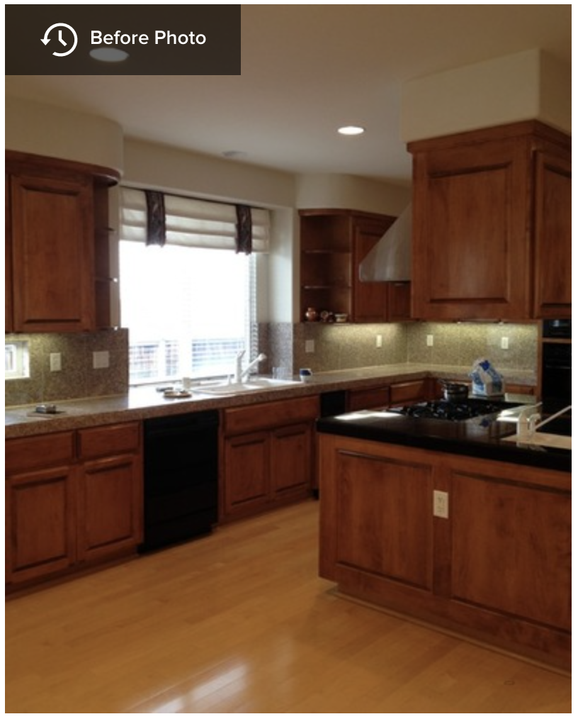
Before being remodeled, this kitchen was blessed with an ample size but cursed with a difficult layout. Because the sink and cooktop were directly opposite each other, whenever two people were working there they ended up doing an awkward version of that disco classic, the Bump. It also came up short in the aesthetics department. “It was if someone had purchased 50 plain brown cabinets and lined them up along the walls,” says Melinda Mandell, the interior designer. The family who lives in the house likes to entertain, so the kitchen is party central. Mandell’s challenge was to remake the kitchen so it would work well and look good too.
Location: San Francisco East Bay area
Size: About 430 square feet
Designer: Melinda Mandell
The designer started by reconfiguring the layout, taking the range and the range hood out of the kitchen island and relocating it along the far wall. This freed up the island for food prep and eating. The refrigerator is now closer to the sink (to the left of it, just out of the photo frame), making for a more convenient workspace.
Before Photo
BEFORE: Looking at the pre-remodel shots, you can see that the function wasn’t the only aspect that received an overhaul. Not only was the kitchen an uninspiring brown-cabinet cave, but it had ungainly elements, such as a range hood that had a back end covered with cabinets.
AFTER: The new kitchen is elegant instead of awkward, with elements like a sculpted marble backsplash behind the cooktop. To create the curvy shape that was inspired by the bell-like lines of the range hood, Mandell sketched it directly on the wall for the fabricator to measure.
Backsplash: Grigio Italia marble, Da Vinci Marble; range hood: Vent-A-Hood
The creative angles have been carried into the lines of the countertop, where a series of “tabs” breaks out of the rectangle of the kitchen island. The squares are supported by legs and columns, giving the island and cabinetry an unusual architecture.
Countertop: White Princess quartzite, All Natural Stone; stools: HD Buttercup
Some of the columns are more than decorative. A series of them are pullouts, providing vertical storage for baking sheets and spice racks. The one to the right of the sink can be pulled out to reveal towel bars sized for dishcloths and tea towels.
Countertops: Cafe Royale granite, All Natural Stone
The columns and the cabinet molding give the room a classic look, which is in keeping with the home’s architecture. Mandell says she chose elements like a black and white color palette and the Sputnik light fixture over the island to appeal to the homeowners’ contemporary side.
Chandelier: Sputnik, Jonathan Adler
Before Photo
BEFORE: Two things are visible in this pre-remodel shot: The unconventional hood and a long desk area.
AFTER: The new desk has a wider cutout for chairs — two of them, in fact. “The desktop was nearly 10 feet long,” Mandell says. “That’s a lot for just one person.” Space for two chairs means both children in the family can do homework at the same time.
The valance is crafted with birch bark-printed fabric trimmed in green. “There’s a lot of beautiful greenery outside the windows,” Mandell says. The designer says that saying something brings the outdoors in is a quote often penned in design articles, but “in this case, it’s true.”
Valance fabric: Eric Cohler for Lee Jofa
The floor plan shows the big picture. The small room off the kitchen was once a butler’s pantry. Now it’s a home bar, outfitted with a bar sink and wine refrigerator.
In this area, the backsplash is an oversize glass brick. “We wanted to change it up in this area,” Mandell says.
In a way, this feature summarizes the new look of the space. No stodgy service area for this new kitchen — instead it’s a space where someone is just as likely to lift a glass as to stow a tray.
Tile: Kiss My Big Fat Glass collection, Alyse Edwards


